About the Project
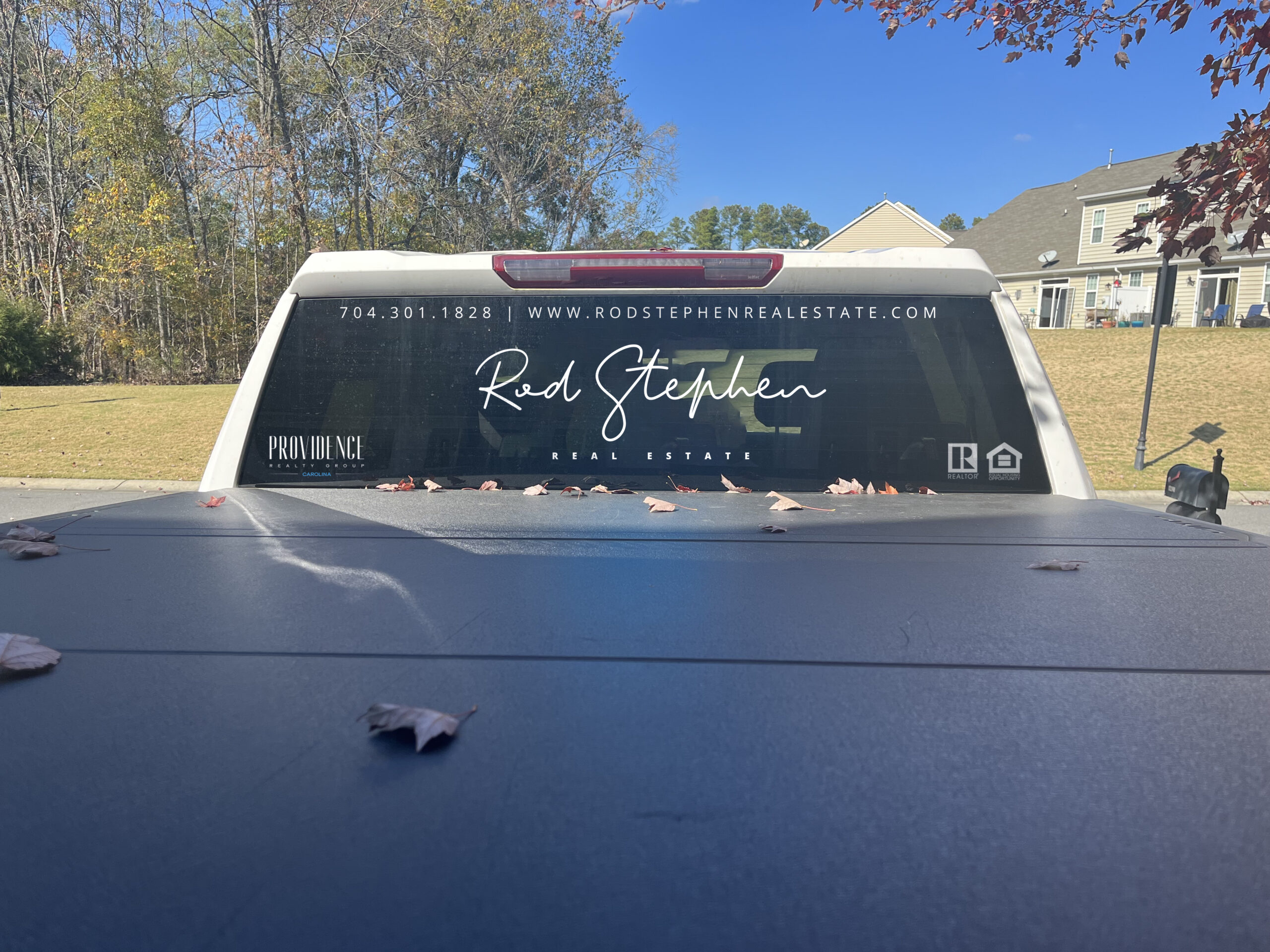
We were thrilled to work with Rod Stephen of PRG Carolina on their rebranding project, they needed to update everything from their business cards to their website. They wanted a fresh look that would make them stand out from their competitors and help them grow their business, so we ascertained their niche and rebuilt their brand on the pillars of luxury, reliability and knowledge.
We started by picking a color palette and then choosing fonts that felt right for them. We then developed a logo that would work well on both print and digital materials. We also decided to use icons instead of photos in some places (like on their website) so that we could create more consistency across platforms without having to worry about getting rights from third parties.
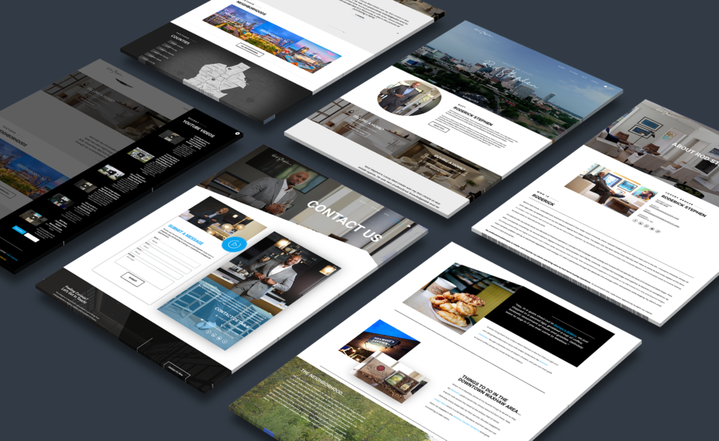
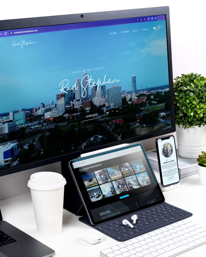
The company was diving into the luxury real estate space and were looking for a way to make their brand standout in a saturated marketplace. They also needed a new website that was easy to navigate and made it easy for clients to find what they were looking for quickly.
The website was created using WordPress which allowed us to create a clean layout that highlighted different features about our business such as featured neighborhoods and an interactive county map for users to search counties visually—as well as links for social media accounts like Facebook and Linkedin to reinforce brand identity and organic funnels of interaction. The site also contains information about local attractions and in the realtors primary metro area.
When it came to business collateral, Rod Stephen Real Estate decided to go with metal business cards because of the durability of metal over paper cards and the ability of metal cards to be imprinted with different textures like foil or glitter. Metal cards also have a distinguished, sophisticated look that sets you apart from your competitors.
They chose letterheads and customized notebooks as well because they wanted something that would work with both letterhead and stationery items. The letterhead also has a nice texture that makes it stand out from other companies’ letterheads, which is important when trying to make an impression with potential customers. The notebooks and folders are designed using the same concept of black on black uv technology.
Client:
Rod Stephen Real Estate
The task:
Rebranding
Date:
01.01.2023